INTRODUCTION
Setting the Stage
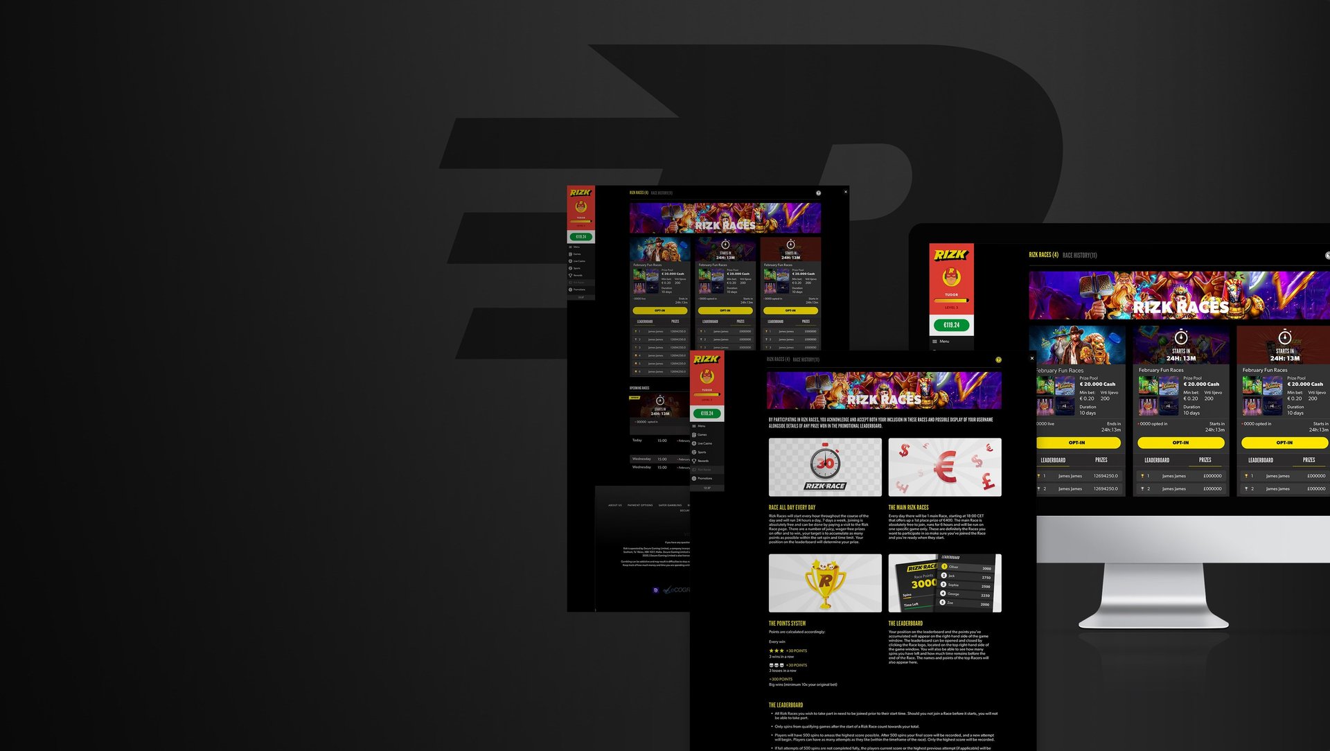
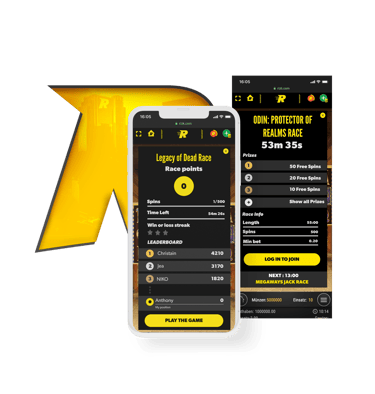
Fasten your seatbelt! We're embarking on a new journey to redesign the Rizk Races interface. This is where I enter the scene, yours truly, the narrator, a Senior UX Designer happy to take you through the twists, turns, and triumphs of this project.
OUR PROTAGONIST
The Character: Rizk
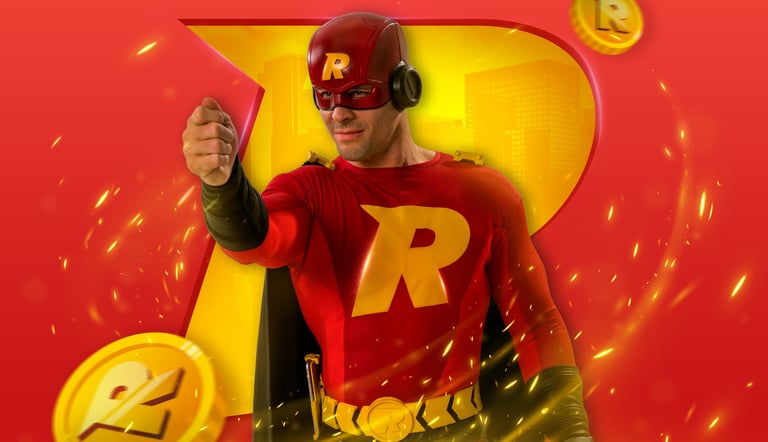
Just like Gotham needs Batman, every thriving casino needs a guardian. At Rizk, that guardian is none other than the legendary Captain Rizk – a charismatic leader, a champion for fair play, and a constant presence ensuring a smooth and rewarding experience for all players.
This adventure wasn't a solo story. We assembled a dream team – a pit crew of designers, developers, and country managers – all fuelled by the desire to change Rizk Races into an amazing gamification experience.
Team Rizk: The Heroes

Redefining the Race Experience
Imagine the excitement of a race – adrenaline pumping, the finish line in sight. Whether it's a high-speed car race or a sprint to the finish line, the essence remains the same. That's the feeling we wanted to capture in the Rizk Races.
Our goal wasn't just a visual refresh. We wanted to mirror the raw essence of a live race and translate that energy into the user interface.
THE CHALLENGE
From Concept to Creation
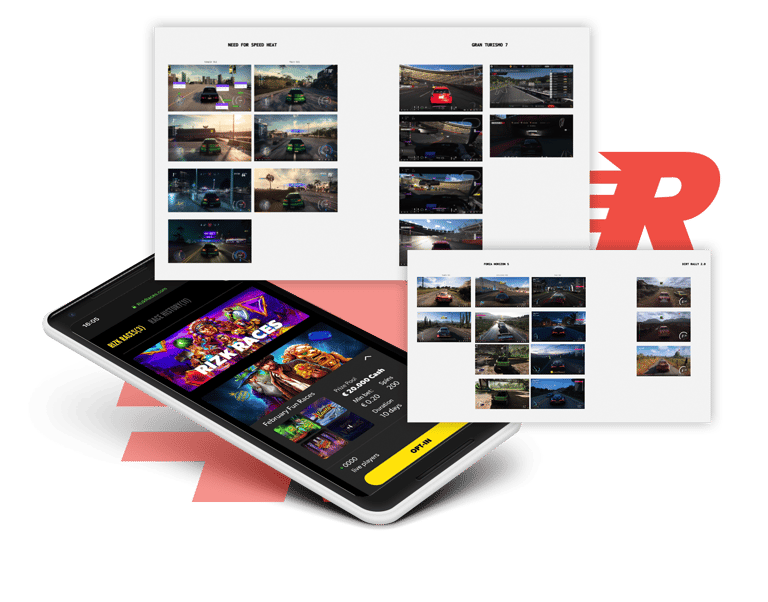
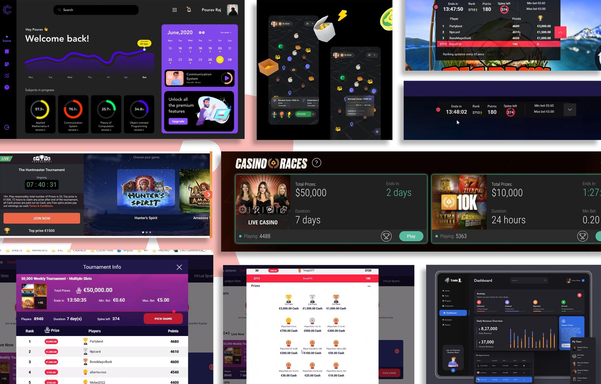
We began by analyzing our competitors and identifying areas for improvement. The existing design resembled a chaotic starting grid, where crucial race details were hidden or very difficult to find.
Competitors Analysis
USER RESEARCH
By analyzing our competitors' interfaces, we gained valuable insights into user expectations for tournament layouts and information presentation. This exercise allowed us to understand what information users prioritize and how they prefer to see it structured.
From the beginning, our biggest concern was how to display the information using large, easy-to-read fonts and contrasting colors to ensure immediate visibility. Let’s not forget that our canvas was as wide as our mobile phone.
Further research, including heatmaps and Hotjar recordings, revealed a persistent issue: user confusion. This frustration manifested in the form of 'rage-clicking' and excessive tapping as users struggled to locate crucial information.
Users struggled to:
1. No Visibility of Progress: The lack of any leaderboard made it difficult for users to track their performance;
2. Game Mechanics: Accessing this information required them to exit the active game entirely, creating a frustrating disruption.
3. Navigate the interface: Switching between different games within the interface proved to be a challenge for users.


Design in Progress
Our initial approach embraced minimalism, prioritizing a sleek interface. We focused on a clean hierarchy, highlighting the race position and remaining time, hoping to mimic the driver’s cockpit.
Iteration 1: Prioritising Minimalism
Iteration 2: Balancing Beauty and Usability
Seeking a middle ground, we aimed to create an interface that balanced visual appeal with user-friendliness. We incorporated the missing information, but internal feedback indicated that the layout felt cramped, and missing readability.
Iteration 3: The Wrong Turn
In our pursuit of a better solution, we encountered a temporary detour in Iteration 3. While attempting to simplify the information, we ended up overcomplicating things. The changes resulted in even more confusing navigation.
This misstep emphasized the importance of maintaining a clear and logical information hierarchy.
Iteration 4: The Final Lap
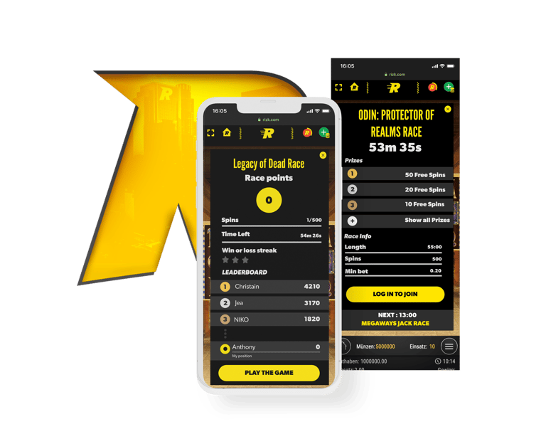
Through a series of iterations and valuable lessons learned, we arrived at the final design. While it might not be the most visually striking interface compared to our initial attempts, it prioritizes what truly matters: usability. In response to feedback, we incorporated the missing information within the interface while maintaining a clear layout.
Key Elements:
User Testing and the Winning Formula
More testing played a crucial role in refining the interface. One crucial insight emerged. While the functionality was on point, users hesitated to click on it, fearing it would take them away from the main game.
The Podium Version
We addressed this concern by implementing a clear design element that indicated the widget's interactive nature. This subtle change transformed the widget into a user-friendly "accordion" that expands to reveal all the information upon clicking.


The Aha Moment: Function Over Form
Here's where we hit a bit of a speed bump. While the initial design looked nice, it lacked all the features that a user might need. Essential information like game rules and time details were missing - like forgetting your helmet before the big race!


1. Clear Information: All the essential race details are presented in a well-organized manner, ensuring users can easily find what they need.
2. Intuitive Navigation: A clear and logical layout allows users to effortlessly navigate through the races and participate with ease.




EPILOGUE
This project showcases the iterative nature of user-centered design. By constantly testing and refining based on user feedback, we were able to transform the Rizk Races from a confusing maze into an intuitive gamification.
This redesign allows users to fully immerse themselves in the race experience, or the game, without the need to pause and go back to check the information, without feeling like they need to call pit stop every second.